Your brand is not a PDF. It is every place a customer recognizes you under pressure: a tiny icon beside fifty others, a splash screen for half a second, a push notification, a website header. At Maverick Codebase we design identity for those moments first.
Stress-test the mark early
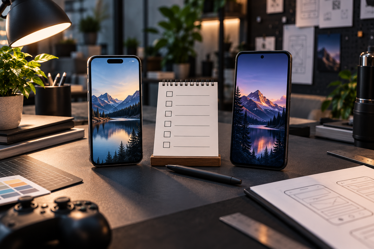
We check symbols at small sizes, on light and dark backgrounds, and in a real device grid next to competitors. If the mark collapses into a blur at 60px, it is not ready for the App Store — no matter how beautiful it looks on a billboard mockup.
System over one-off art
- Type and color that survive dense UI
- Iconography that matches product weight and tone
- Guidelines a developer can follow without a designer in the room
- Asset packs ready for stores, web, and social
Product and brand as one conversation
When branding and product design happen in silos, the app feels rented. When they happen together, the experience feels intentional: splash, empty states, buttons, and marketing site all speak the same visual language.
A brand should travel — from the store icon to the last screen of the product — without falling apart.
Building a product and need an identity that holds up in the wild? We will craft the system and apply it where it matters most.



Comments(00)
No comments yet. Be the first to join the conversation.